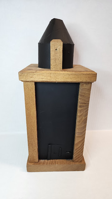
Final Update - Finished Piece (02/23/23)
what am I trying to say?
I am not sure what this is about or represents. But what I'm trying to communicate is “What is that?” Like trying to figure out what something is when you encounter it for the first time. But I also wanted the feeling or concept of not being related to earth and being abstract.
What I think works and does not
I think the blackout of the room works well for my piece as it separates the outside world from the world inside the container if there were other ways to view it such as an open side or clear glass it would not have the same feel or aspect to my piece. In addition, the glow-in-the-dark enhances that feeling or aspect of not being a part of this world. However, the glow-in-the-dark needs to be charged enough with light to give it a proper strong glow. Like that of a phone flashlight. Leading me to the lights it has now. The light it has, that being ferry lights do work in terms of fighting into the container and not looking out of place. They, however, don't seem to be strong enough to charge the Glow-In-the-dark to what I would like. I have the light in slow fade which works so that the viewer does not have to interact with the piece physically/manually but the duration when it dims out to off and back on is too short for my liking to be able to properly view the Glow in the dark of the forms.
What I would change
I would like to find a better light source that is similar to ferry lights in terms of size, but stronger lighting and a longer duration of the lights being off in the fade setting/choice. I would also like to make the viewing dome out of metal like copper sheets or aluminum sheets. The reason is that it will be sturdy, smother, and cleaner. And if I use copper I can solder pieces together vs superglue on 2 cardboard pieces.
Things that I did add/change during the process
I added a cone on top to help enclose the circular hole at the top. The cone also serves as a spacer to view my piece. another thing I did not mention before of what I wanted to do was that I was painting the inside mat black to isolate the space from the outside world to the confined space of the container. Doing this brought attention to the forms and allows for the glow in the dark to work more functionally. Lastly, the light source that I decided upon at the last moment was to use ferry lights as they were small enough that I can fit at the top without it being too obvious. The light also serves the purpose to view the forms, and charge the glow in the dark paint.
my work statement
My piece “What is That” (title may change) is a scale model of a plausible art piece. The height is 8.5 inches tall, 4.5 inches wide, and long. Each inch equates to 7 ft in length. The model/forms are created from sculpey supported with wire, then covered with light-sensitive paint that glows in the dark. The supplied light is set to a fade cycle to allow the light-sensitive paint to charge/absorb the light and glow when the light fades to black. When the viewer walks in I want them to be separated and transferred to another space entirely than what they know or are used to. That is the goal I strive to achieve in making this piece. Once entered, I want the viewer to feel like they don't know what is going on, do not understand what they are looking at, and question what they are looking at. This allows for their imagination to run its course and make sense of what they are seeing in their way. Many viewers and many different narratives for each viewer. To make this all happen I simply started with what I liked and what inspires me. I tend to be drawn to curvilinear and sharp forms both in 2d and 3d. As I draw and make these forms I let the curves, turns, bends and points do as they wish with guidance to what feels right. None of which has a designated destination, leading itself to abstraction. Further inspiration influencing what I do are artists such as Roxy Paine. Paine's artwork was first influenced by the interaction of industry and nature, Control and chaos, and form and theory. Rooting from that a little more recent are his Dendroids. Tree-like structures made from steel. This inspiration came from Paine's beginning interests in the human brain and nervous system. Though Paine’s inspiration came from the human brain and its neurological connections for his Dendroids, and other sources. Mine comes from the need or want of chaos and abstraction, as I grew up being more or less organized, timely, calm, and patient to name a few, and did not get to experience the chaos of life. This gets reflected in my artwork and in this piece “What is That” as the forms are chaotic and abstract, yet they have some sense of organization and calmness/patience to them. That however is my take and my narrative out of many from those who view and experience my piece.
Progress work #4 (02/20/23)
I think I'm just about done or nearly done. The only thing that I can think of that I can work on is restaining the wood so that it does not look so unfinished, and adding lights on the inside for convenience. But a temporary fix or alternative is to use a cellphone light for a few seconds and place the cap back on and view through the cap. I would also like to add a small tiny person to show the scale of the forms when viewing through the tiny door at the bottom.
Progress work #3 (02/17/23)
After doing multiple layers of glow-in-the-dark, I have now placed the forms in the container. I do not have a light source inside of the container, but do want to place lights inside to make it more convenient for viewing and charging the forms(glow in the darker paint) inside.
Progress work #2 (02/15/23)
date these Fabian
Progress work (02/13/23)
Update #2 date these Fabian
New Sketches
After some helpful advice, I have adjusted what I will be doing. Basted I am basing this form on artwork I have done in Metalsmithing and sketches I have done for that class. Artist inspiration that I am looking into is from Roxy Paine. read what he says about his work- how he writes about his work.
This artwork does not have meaning yet, till I finish or think of something along the way from the building process. I did a rough sketch of the front and side view of what I would like to construct. This ties back to my abstract work. I will be making it out of wire and sculpy to be able to manipulate the forms I desire. Additionally I will be refinishing the container to make it fit in more with what is going on inside like a darker stain or acrylics wash and a small door at the bottom to show scale and another view point. Another thing that I want to do was to etch the glass and black out the inside. I would also like to add a RGB light that would work with this to make it feel mysterious. I would have the light come up from the center at the bottom or around the edge or at top around the center circle, or at the edges at the top. The forms will also be painted with a light or dark gray, as I don't want it to be fully black nor white.
About Roxy Paine
Paine's artwork was first influenced by the interaction of industry and nature, Control and chaos, and form and theory. It later became more of people in the industry and people in nature and the space around them. Paine went back and forth in these topics or conflicts and made machines that painted or that interacted with nature in some sort of way. Rooting from that a little more recent are his Dendroids. Tree-like structures made from steel. This inspiration came from Paine's beginning interests in the human brain and nervous system
I in particular am drawn to Paine's Dendroid sculptures as its similar to what I like to do with sharp curvilinear forms.
https://vimeo.com/108249605?embedded=true&source=vimeo_logo&owner=22069728
Small update #1
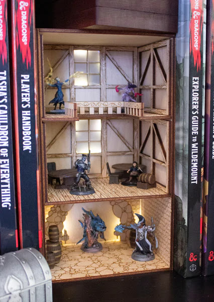
I am still working on what I want to do exactly but what I have in mind is having multiple floor levels with things or the stuff that I would like to have as a setup. If that makes any sense. Another thing that I would like to do is like a treehouse kind of feel. with it having items that are man-made, but instead of people living in it, it would be animals. But I'm debating if I should have the animals be more anthropomorphic or stay in their feral form.
I have the dimensions of the inside of the container. Note the container is not perfectly square, it is slightly shaped like a trapezoid. H - 8.5in, W - About 4 to 4.5in, D - About 4 to 4.5in
I also have a to-scale drawing of the available space for my floors
Videos to share. Examples of small worlds, Book Nooks
Below I have some Ideation of what I like or what I could do.
Your ideation is extensive, which is great, but what is at the heart of your ideas?
Sketch 1 - An Artists Dream Home
Why make this? What does this communicate?


